Let’s start with a pretty straightforward analogy…
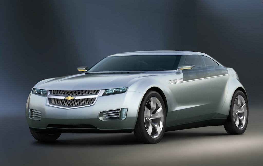
In 2007, Chevrolet showed off their concept car for a new hybrid—the Chevy Volt.

I’m not a car guy, but that looks streamlined.
It looks fast.
It’s intimidating.
Here’s what was eventually released, after reality set in.

Well damn, that’s disappointing…
It’s pretty easy to understand how that happened. The initial concept would be far too expensive to build for mass market adoption. Visually, it doesn’t feel like a sedan for the family, but a muscle car, which would be fine, except that further reduces the size of the market… Plus, there were likely a ton of details left out in the concept phases that would add even more cost and complexity.
And so it is every time I see some beautiful concept work from a designer, reimagining popular apps, devices or services.
Concepts aren’t tied to reality. They aren’t constrained by the needs of a business, applicability of market forces, or even the desires of end-users (beyond the designer herself).
No requirements were gathered from stakeholders. Implementation details didn’t have to be hashed out with Developers. There was no one in Legal double-checking how the data being gathered would be stored and used.
It was designed knowing that it would never need to be built.
Now, I understand why designers craft concepts. Most often these designers are early in their career and need to build a portfolio and reputation. Redesigning a popular app can make a splash if you do it well, and it certainly looks better than the three class projects currently in the portfolio.
Plus, it’s fun to have that freedom. To explore a different path, free from constraints.
That said, when reviewing portfolios, I can tell you that I gloss over these concept projects. They don’t tend to hold much weight with me. I’d much prefer to see a small project executed for and with a non-profit or group the designer is a part of. Show me a project where you had to please other people, conveying their message and trying to solve their challenges and I’ll take notice.
A site or app for the local animal shelter will beat out a Spotify redesign concept every time.
Especially if it gets built.
Related
- New designers: here’s what you can do to stand out— How to improve your odds of being noticed by hiring managers when you’re starting out.
- The Branching Career Path— Great people should be able to build their skills to receive the recognition & compensation they deserve, whether they wish to focus on their craft or on managing humans.
- Interviewing – Up, Down & All Around—How I interview people for my team, peers in other teams and my potential boss.
- Why are companies scared of “junior” people?—Here are my thoughts to a question I was asked a while back: “why do companies fear
hiring “junior” people?” - “You Don’t Have the Experience for this Role…Let’s Talk!”— Embracing Junior Designers Who Apply for Roles that Require Experience.
- What it Means to be “Senior”— A “Senior” title isn’t earned in years, but in experience and outlook.
- T-Triple-C— four traits that matter above all else when hiring.


